


The Watermarks of Photography's Masters
Photography's greatest knew the importance of stylish, branded watermarks. It’s why you almost never see their work without them.

Watermarks are a blight on photography. In my humble opinion, of course.
Watermarks offer little meaningful protection while simultaneously ruining the aesthetics of an aesthetic work. They’re self defeating — with one exception.
If your work is used without permission, and if the infringer removed your copyright notice, that can be construed as evidence of both intent and understanding. Meaning that if you do find yourself in court it should be easier to prove the infringement was neither accidental nor incidental.
But defining copyright does not require a big, bold watermark obscuring the image. Doing so only makes an image uglier. It’s the worst of both worlds: ruin your pictures while provide no additional protection. A terrible idea. In my humble opinion, of course.
I published the following paragraph in PC Photo magazine in 2008:
If you’re a high-paid photographer whose images are really in demand, I can understand your hesitation to post a high-res file unprotected online. But there are so many better ways than obliterating a beautiful image with a trashy logo. Not only do obnoxious watermarks make your photos look bad, they make you look bad too — like you’re more afraid of someone stealing your precious photo than you are interested in showing it to the rest of us. Be smart, protect your work within reason. Include important information in the metadata, and even run a copyright notice across the edge of the picture if you’d like. But completely ruining an otherwise lovely landscape with a tacky logo? That’s a travesty.
I’d say that’s about right. Still holds up.
The one exception being, of course, if you’re a master of photography.1
Many people don’t realize that the greatest photographers of the 20th century understood the power of branding and the importance of protecting their images with watermarks. I look to them for guidance.
One of the most iconic watermarks of the 20th century belonged to the father of modern landscape photography himself, Ansel Adams. Rarely did his images appear online without that familiar A.A. mountaintop logo.
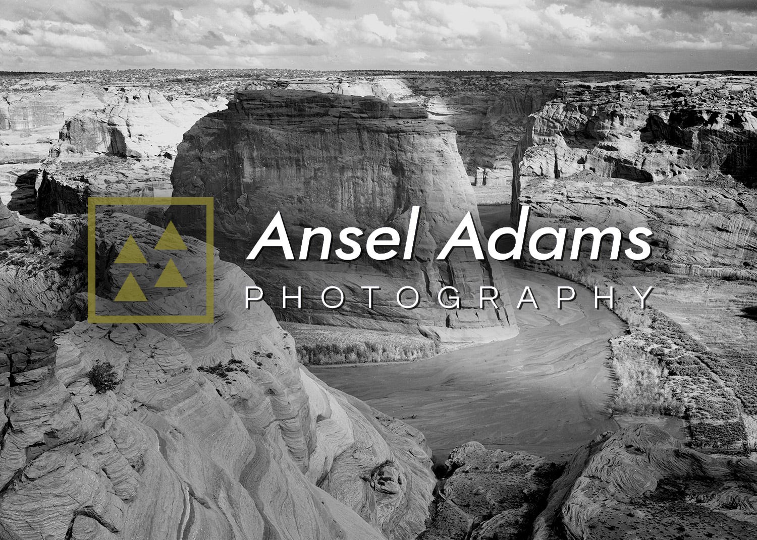
How about that subtle use of drop shadow mirroring the shadows in the canyon landscape. Absolutely brilliant design.
Another all-time great, Henri Cartier-Bresson, used quite a contemporary logo style for his watermark — again putting him ahead of the curve.
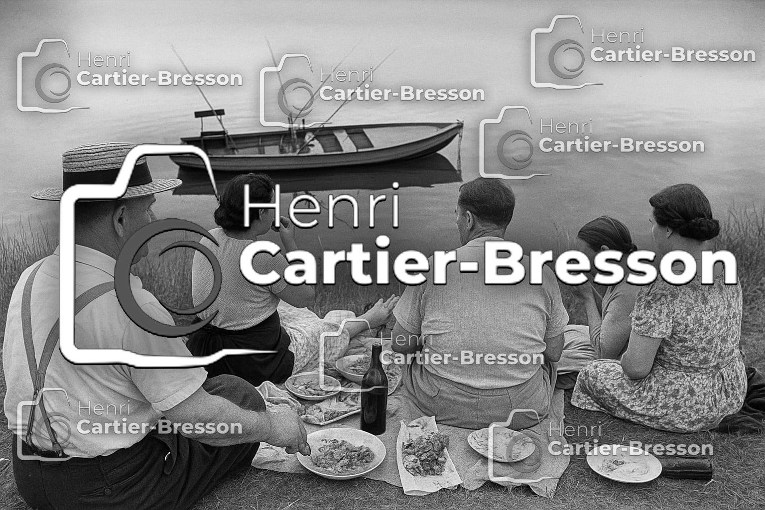
I will admit, I find this one a bit heavy handed. Borderline distracting, even. But he’s the best so… I defer to greatness!
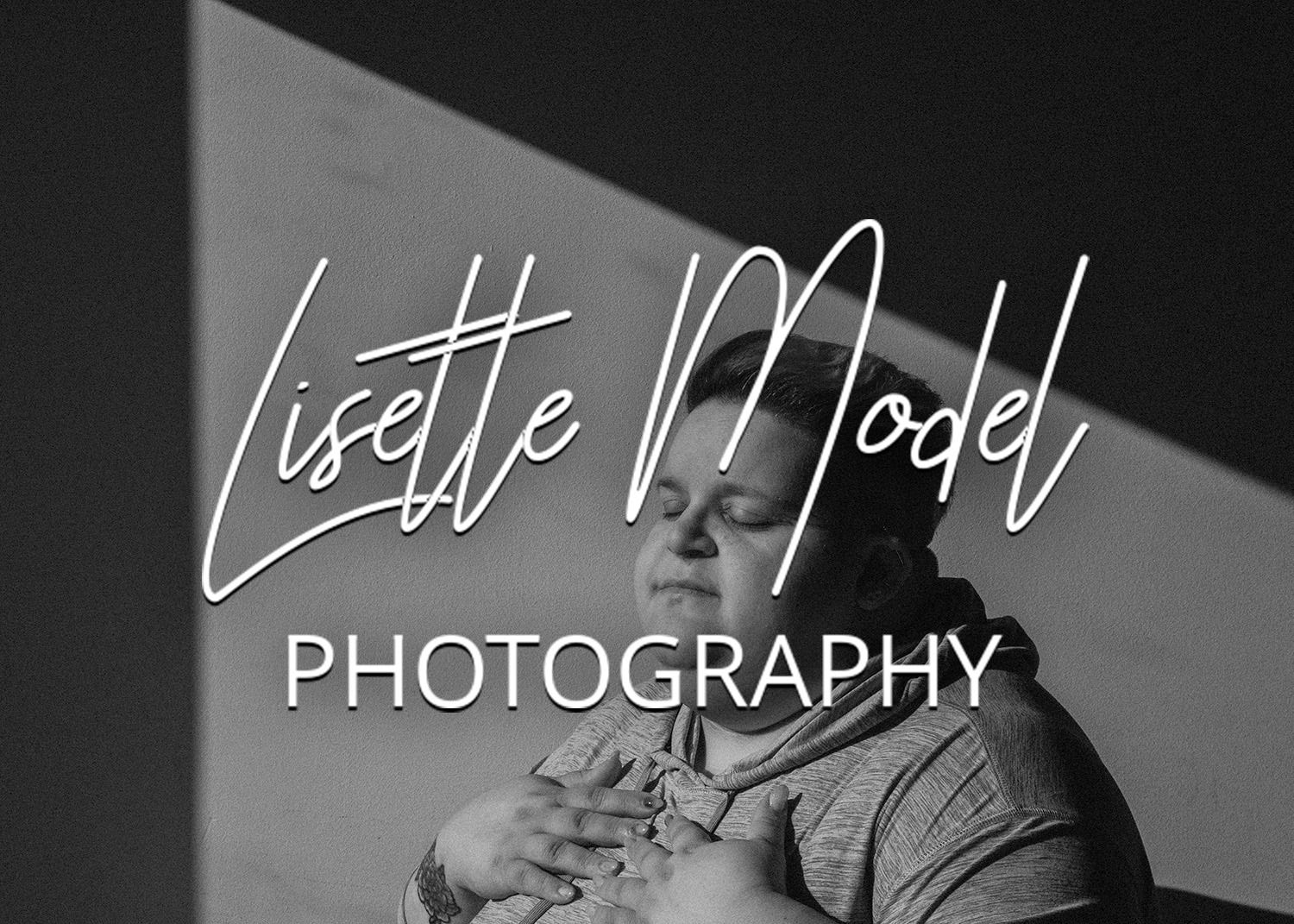
Street photography pioneer Lisette Model utilized a classy signature — not her own signature, of course, but someone’s signature — to put a more relatable, personal touch on her branding. I think it really works!
And of course her student, Diane Arbus, employed a relatable camera logo. This is something she really pioneered: the use of cameras and — of course! — aperture-blade shapes to visually signify that a photograph was, in fact, created with a camera. Zero confusion!
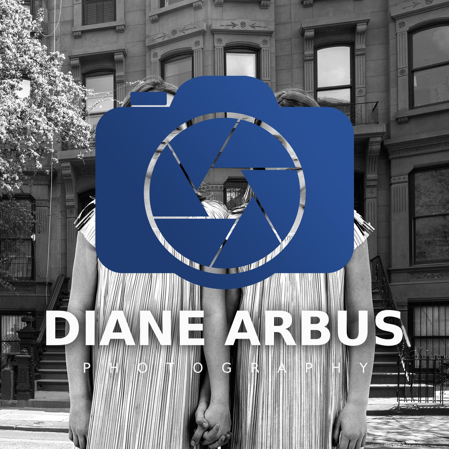
Ironic that Arbus used a TLR but chose an SLR for her logo. Regardless, the look eventually became so popular that the camera/aperture icon is now considered in some elitist circles as borderline cliché. Preposterous!
One of my all-time favorite watermarks belongs to a photographer who was always a trendsetter, perpetually ahead of his time. It’s Richard Avedon’s never-ever-ever before seen “circle with crossed lines in the middle and an ‘established’ date” icon. I don’t believe it’s been done since, in fact. It’s truly unique, and still totally and completely associated with Avedon’s brand and only Avedon’s brand. Surprising that we’ve never seen anything like it!
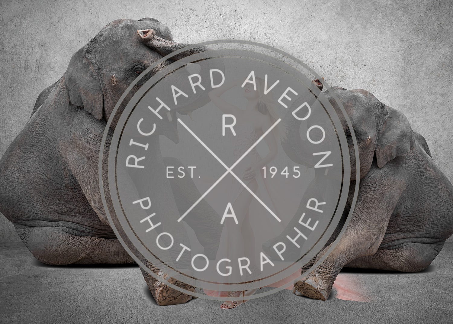
I think this one really has potential. I hope that more photographers — and even agencies and designers — will adapt this unique logo style to showcase how truly creative and innovative they are.
The examples above make it pretty clear: if you want your work to be taken seriously, you’ve got to follow the lead of photography’s greats and obscure it with a watermark. The cheesier the better. In my humble opinion, of course.
If there was a sarcasm font, this is where it would kick in. Consider this a “satire cue.”
Fun post! And correct imo
Oh god those watermarks are so funny. Well done~